hiz skincare for men
This project involved the creation of a premium brand identity and packaging system for a men’s skincare range, with a strong focus on developing a product presence that would immediately stand out within a highly competitive retail environment. Extensive research was conducted into existing skincare packaging trends and shelf presentation, leading to the strategic decision to utilise a predominantly white packaging base to maximise contrast, clarity, and visual impact amongst competing products.
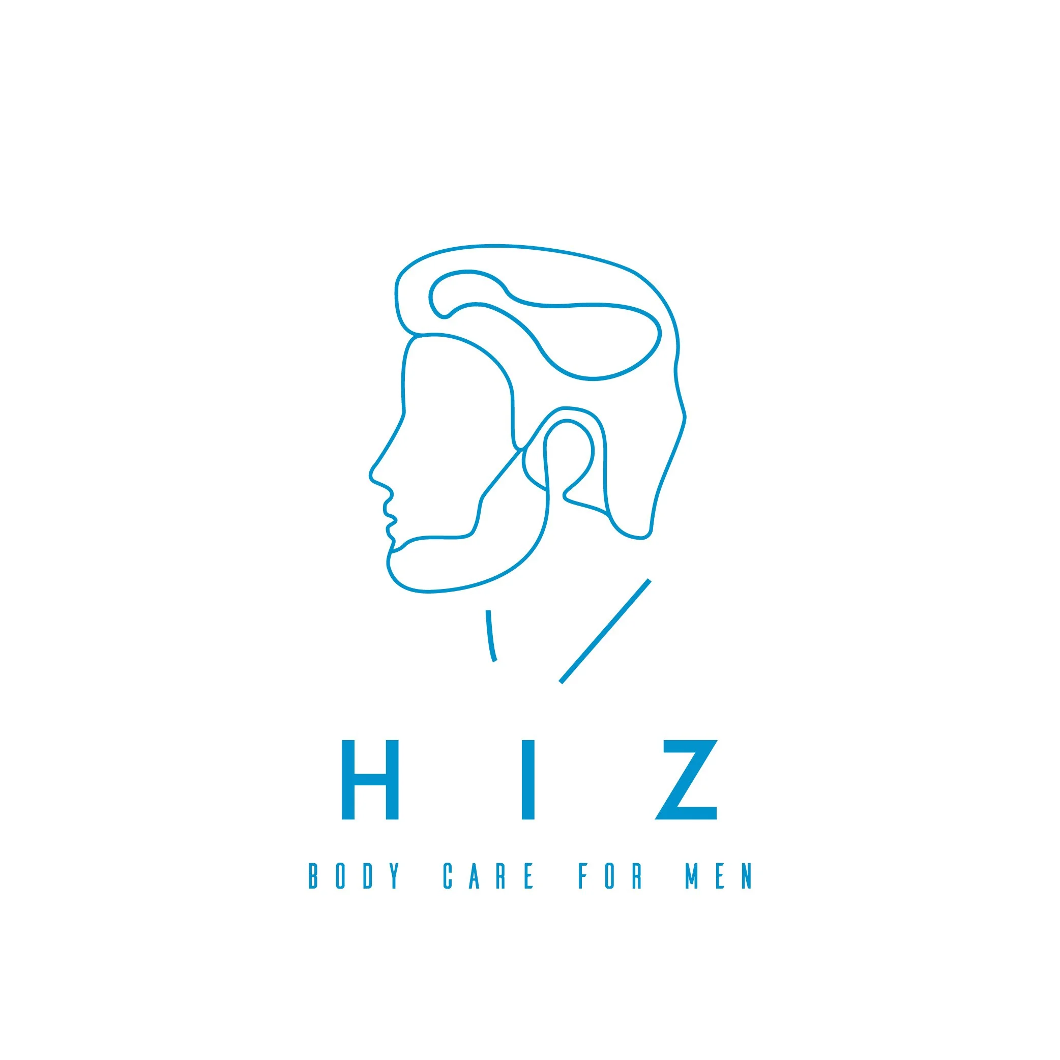
The creative direction was inspired by the side profile of a male face combined with abstract linework to create a highly minimal and contemporary visual language. The result was an ultra-clean and sophisticated identity that balanced simplicity with strong shelf presence. A bright modern blue was introduced to inject energy and create a recognisable brand accent, while an abstract custom type treatment further reinforced the modern and distinctive aesthetic.
In addition to the brand identity, a complete packaging design system was also developed, incorporating the full logo suite consistently across the product range to create a cohesive and premium presentation.
View completed packaging design here.
back | NEXt