bluebird antipasto
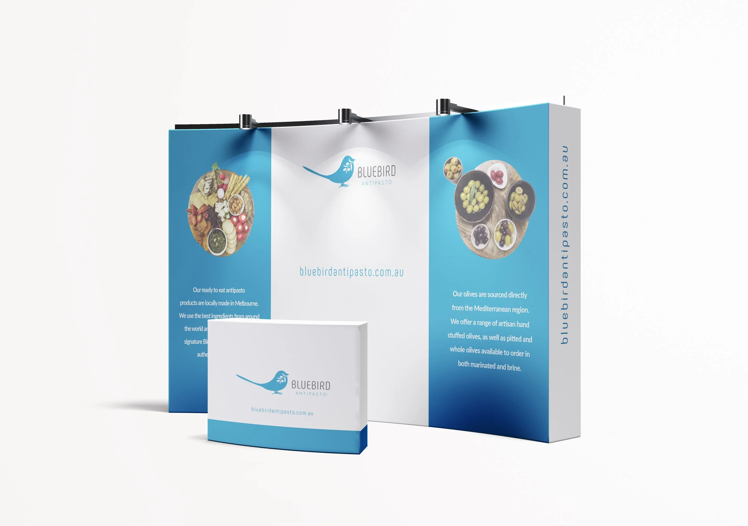
This branding project for Bluebird Antipasto was developed to reflect the fresh, locally made nature of the company’s artisan antipasto products while establishing a refined and approachable boutique brand presence. The objective was to create an identity that felt contemporary, memorable, and visually connected to the handcrafted quality of the product range.
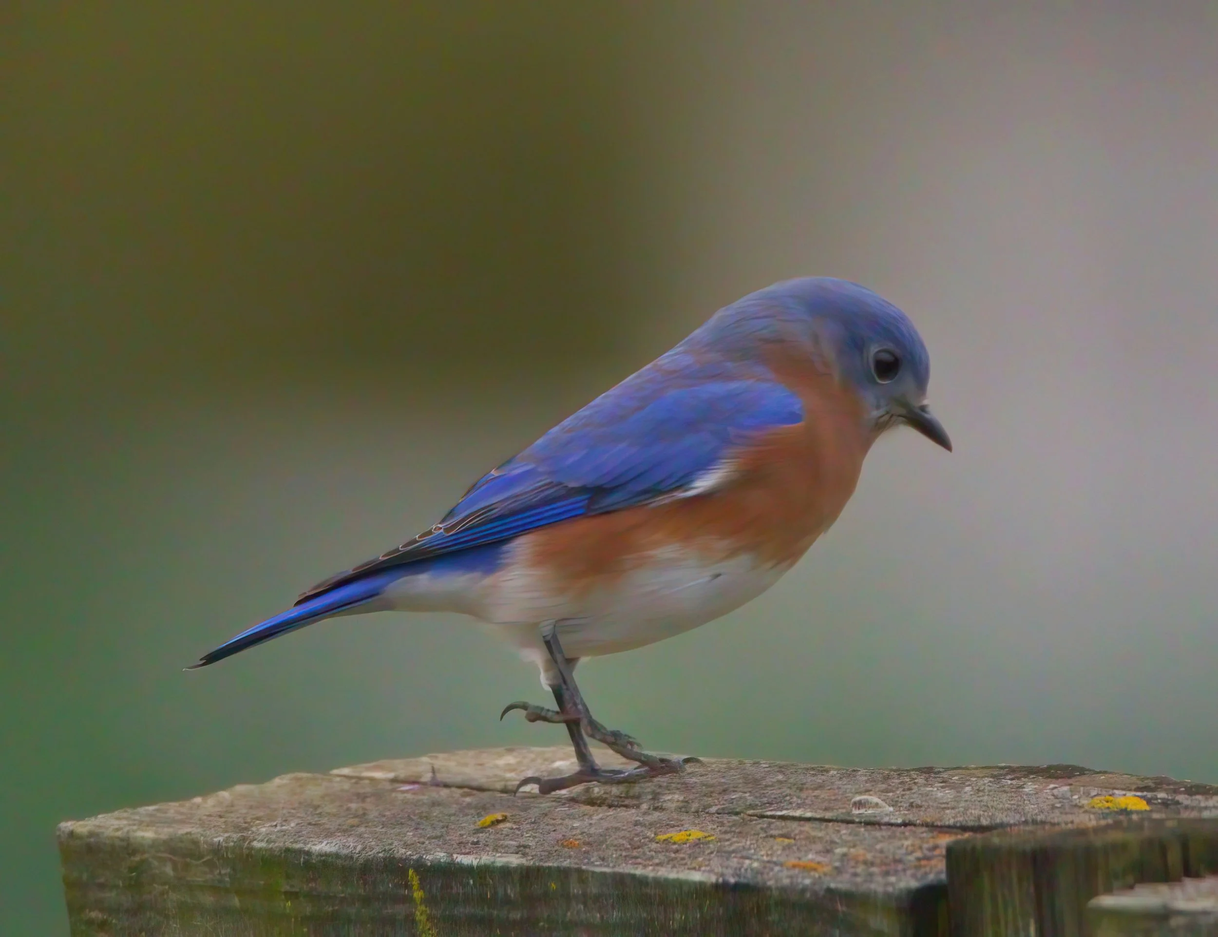
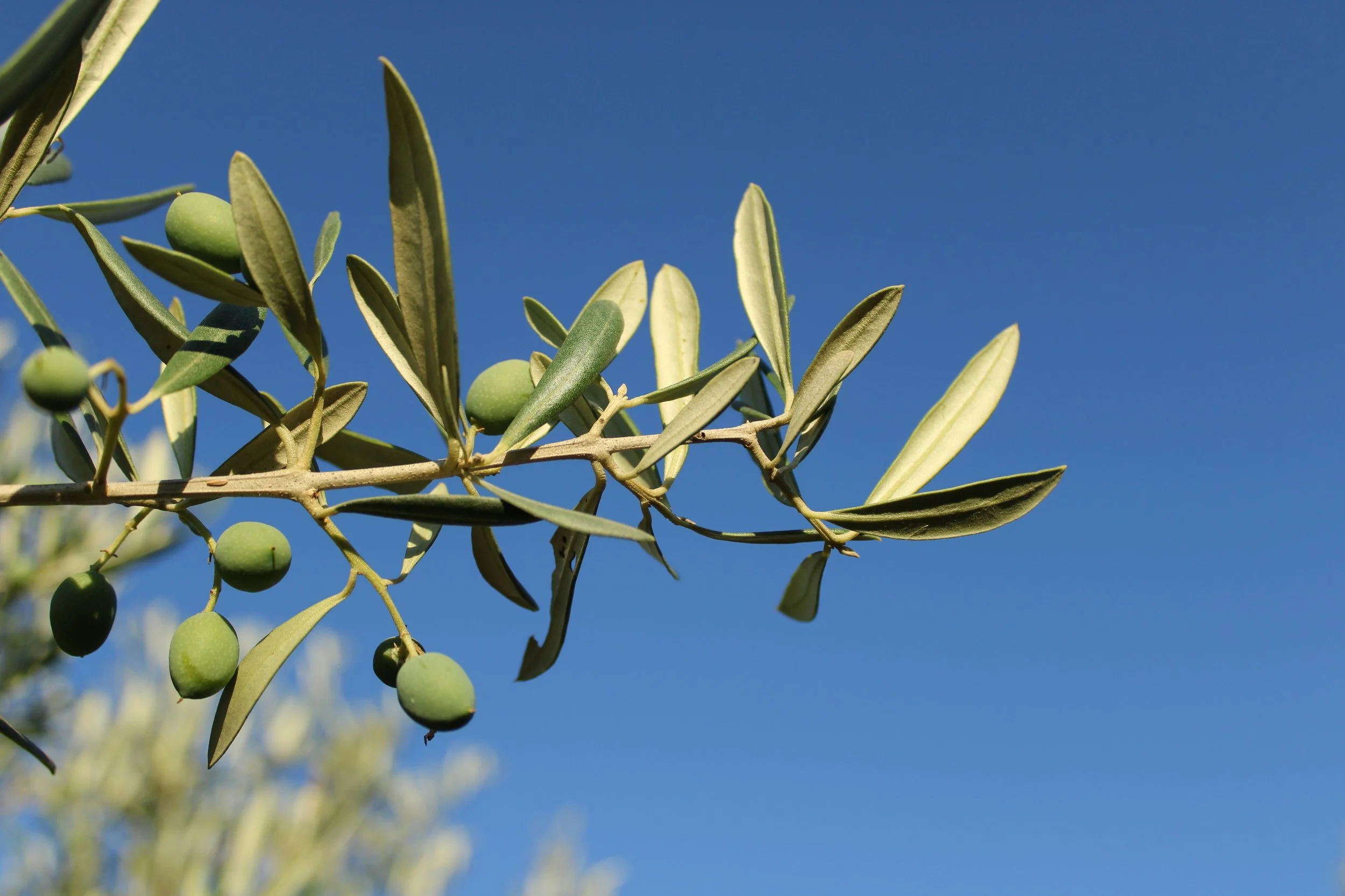
The logo concept centred around a simplified curved outline of a bluebird, chosen to create a soft and welcoming visual aesthetic while reinforcing the business name in a subtle and elegant way. To further connect the identity to the brand’s product offering, an olive branch was incorporated into the bird’s mouth — referencing a key ingredient commonly associated with antipasto and Mediterranean-inspired cuisine.
Supporting the icon, a curved and modern typeface was selected to complement the flowing forms of the logo mark and maintain consistency throughout the visual identity. The final outcome balances simplicity and sophistication, resulting in a cohesive brand presence that feels both inviting and contemporary.
back | NEXT